Ahahahaha....Haven't touched this film since June. Might be a good thing. After all, now that time have passed and I have all the time in the world I realized that one section I didn't have time to have fun with is all mine to play around with as I please.
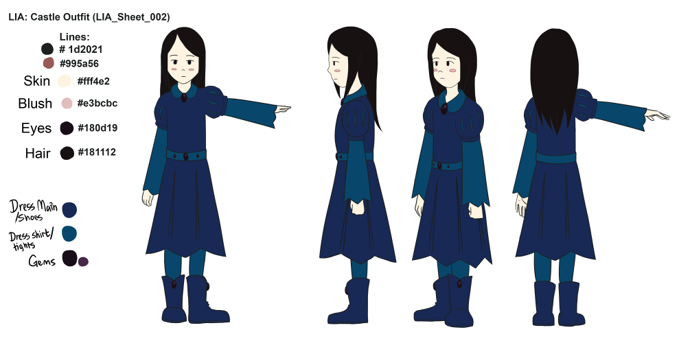
Next section to animate is the castle scene, and now that I had a second look....I don't like the old costumes so I redid them. Background colors will be the next on my overhaul list for this section. (aka. what was I thinking and why did no one stop me.)
And on another note: It looks like if I want any music done for this I will have to get my own piano and magically become the master of sound. Or I will just wait until the film is over and done with completely before bothering with any kind of music at all.
Revisited the animatic as I got some feedback saying that some parts were a bit off.
Another tutor made me change the colors so that they all went along with one another, as well as making new costumes for the castle scene so it would look more like a party. I didn't want to confuse people by changing the outfits around too much, so I decided to not change the colors and overall shapes of them, also unfortunate as it is I do not have the luxury of spending a long time on doing pre production and play with things in a grand fashion unless I plan to kill off my animators during this production. I know they could be capable of animating something more complicated but we simply do not have the time to play as much as I'd like.
I managed to re color all the sheets I previously had as well as making a new one that is for the marry go round horses because I realized that I didn't have one.
I decided to take a day away from the studio to do work, I find that I need a balance between being in and not being in. I simply can't be in constantly unless I plan to go insane.
I did inbetween animation and a background for Crocodile tears. It was supposed to have trees in it, but he said he didn't like it, although I think I might try to do another version with trees and not make them black, use colors instead, like the buildings - because to me it looks too empty, and especially when they are supposed to be in a park and the previous scene has tonnes of trees in it.
Then I tackled my own project. I didn't like my previous color key page so I made a new one which I like much better. Also I traced the 3D models Conner gave me so that I have a 2D reference people can work from on the props. I got the scooter and the umbrella, still need to do the broken umbrella, but for that I need to speak a bit with Conner again and ask him to tweak the 3D model and I need to check on the person that is supposed to design the water dragon since I am still missing that character - I'll also need a reference sheet for Roy, the boy at the end.
I have found abandoning Photoshop and work in Sai gets everything done faster for me. I like rotating my canvas and flipping it at a button rather than dealing with clicking X amount of buttons before I can do any of that. SAI I love you, why are you not an industry standard?
I have gotten around to finish the costume changes for the main character. I am not entirely sure about the dress though. I need it to be white and simple, but still keep her overall shape and not have it look like her coat. I figured it had to have the fuzzy part since the rest of the film is put at autumn, and the funeral part is having a completely black and white environment it would be weird if it was summer dress.
I finally got the Character sheets done, some help from Darren to color one of
them.
I also did this test image using a background that Likem did to see what the style would look like. I got an overall better response on the one that didn't look fuzzy, like one of my tutor put it "looks out of focus"
I have been in contact with a second year that was initially going to be my producer, however she was unable to take it all on so I will have to find a new person for that job.
I finished the animatic for FALU
It wasn't as bad as I thought it would be, until it was about an hour left before hand in, because the hand in site wouldn't let me upload anything which was a real pain.
I got the drawings of the umbrella done so that it could be modelled as a 3D model by Conner, just like he did with Birger's scooter.
I have done a test background just to see if I could emulate the looks
of watercolor. I find it is quite easy to do in Paint Tool Sai, though I
am not quite sure how smart a move it is to use this program since most
people use Photoshop. However it is the program which makes it easiest
to deal with the effect I am looking for. I know the tutors would prefer
industry standard programs, but I wouldn't see the point if photoshop
takes two days to finish something that could be done in four hours.
I
am having Darren doing a rough little walk of Lia on the background so
that I can see what it would look like when I put something on it. I
will try out different ways of animating on top of it, I might end up
going into photoshop with it if I can't find another way of doing it.
Flash has such a distinct look to it unless you -really- know how to use
it, so I will look into using TV Paint. However there is the issue of
our studio being deemed a less important course by the university and we
don't have enough licences at crunch time. So all in all I will try to
do a draw over in photoshop instead to see if I can make something that I
like. I think I will do that first, and just use it as an example of
what I want the style to actually look like when it's finished and pick a
program based on that. Or just be one of those weirdos that decide to
do roughs in flash to get the time right, import it into Photoshop to do
the clean up and coloring in there. At least I know we have enough
program licences for those two programs when the deadline is coming up.
I
have also gotten a start on the character turnarounds, noticed I am
missing the 3/4 view so I think I might have to go and do that one next.
Crocodile Tears Darren was told his original concept didn't
seem to make the environment sizzling hot so I decided to do butt in and
do a quick color test with what I have learned from watching CSI:Miami;
drown everything in an orange filter at all times.
It was approved by Darren and I did a proper background for him based on the layout he provided me with.
I didn't really change anything on it, I found that making the map flat or oval shaped simply ended up confusing and looking pretty bad so I went with the round planet instead. There is an instance or two I would have liked the animation to be smoother - it seems a bit quick, but I only had 20 seconds to play with. The end was supposed to be animated, not still shots of them jumping all into a pile, but I simply didn't have the time to animate and color it all if I were to hand it in on time.
Either way I had fun doing this. Even though I worked alone on it I had a lot more fun than my initial project simply because I was making it not only for myself, but for my friends as well. It is a whole different feeling working on something when the people around you are positive to what you do.
I'm on it again.
Attacking animation with photoshop.
Think I'll end up making the globe into a flatter oval-ish map instead, the way it looks is bugging me....
Anyways, was told to do "a personal animation" something "that represented me".
I didn't really know what to do in the beginning, but after an unhealthy amount of hours listening to Monkey Majik songs I found that I'd do one of their songs in a style based on anime openings/endings. I went with the English version of their song "open happiness" not only because my teachers would have no idea what the text is in Japanese and I don't want to subtitle it, the English version, although sounding the same actually have a different text from the Japanese version which fit better with what I was doing.
If anyone argues at any point this animation is not personal just because I say it's based on anime and I picked a song by one of my favourite bands...they simply don't know me well enough to find the personal meaning in it. ù_ú (and I have no intention of explaining it to you if that is the case.)
Uni decided to give us a project to practice making short movies for our third year. I went with the option of picking a picture and making a story out of it.
I came up with the idea of eyelamps.
Because that is totally not a recipe for creepy things. At all.
Somehow this ended up a bit more violent than what I initially wrote down. I guess that's what happens when you don't really have it fully structured all the way.
I chose not to add sound to this for a couple of reasons:
- I didn't want to do the voice over for the news reporter/commercial commentator myself. I felt like my girly voice would kill any kind of gritty mood this thing has.
- I don't actually have a music track in my head for this one. Just the squeaky sound of metal joints moving and "I have been running too much" breathing.
- If they don't understand the story from this...then I don't think sound adding would do anything for it.
Decided to have another go on playing with lip sync. I don't know if I will try to polish this up or not, nonetheless it was fun to play with it again.
Animated with photoshop CS6. I like it, it actually have a timeline and you can add sound on it now.
Done a few concept things for the pick and mix.
The first one
is an idea for the Angels/law firm office he works at. Was thinking of
picking lighter colors from pictures to make them be the good guys at
the same time as Georges Barbier seem to use a lot of pastels and blues
in some pictures. There is a phoenix at his desk since I thought of
picking that as their logo thing, also my artist seem to like to draw
birds, especially phoenixes. I simply decided to name them Phoenix legal company
for now.
I know he really loves his bright red, but I thought I'd
save that and the heavy black/gold for the demons office/law firm and
also use a dragon for their logo/mascot as he have drawn a couple of
those, it will also symbolise more of a threat since dragons are big and
scary. Not sure what to call them though....
Did a few concept drawings which I colored. One for the city the law
office is in (featuring the mentor and the angel), the train they have
to take to get to the allotment area and a little part of an allotment. I left the sky white in the last one because my artist sometimes does that, but I will probably draw a new one with blue sky.
These pictures are mainly testing to see how things might work, so none of them are final, especially not the allotment one. I find it really hard to keep the style of my artist while trying to draw normal looking things, mainly because he only ever do single illustrations which means he get to play with just how much detail he want to, or lack thereof. I feel like I can't really do that when I need it to be a specific place, like the city. I can't just have a big open space with one building on it. So I'm trying my best to at least keep the shapes and the typical types of buildings that he does.
With the allotment I feel like I'm trying to draw an organized version of Alice in Wonderland. He's got lots of pieces of plants and nature in his work, the only thing is that he loves to make that the most detailed thing in the entire image, so it does take up a lot of the attention. I won't have much of a problem with my Phoenix lawyers as they are quite simple, but my demon might prove a problem as she is based on his more pattern crazy clothing he's done.
He's supposed to say "Mmmhh, It would be nice to come over...".
A little something I did based on a picture I made for Kerri a long time ago. Figured it would be simple enough to try out while figuring out how to work the photoshop animation feature. I must say, I like it most of the time.
I can draw with my beloved opacity and now that I figured the frames are exactly the same as the layers it's really easy to do it. The only thing I miss is a proper timeline for the times I want something longer or shorter than the set times you can pick from - but I don't see why I can't learn how to work my way around them.
I actually find it more fun and interesting to animate like this. I can draw on the computer, but it's still pretty close to a traditional way of doing things with the whole "must learn timing properly on your own". I now think I appreciate dope sheets a bit more. They didn't make any sense when all I had to do was to copy-paste and tweak here and there - everything worked itself out smoothly, I didn't really need it. Now I appreciate having a paper telling me what comes when. I will probably have some more fun with this and see exactly what I can get done with it.
Have been doing some small scribbles in Photoshop just for fun. I like animating in Photoshop of some reason, probably because it let's me have opacity (whoever makes flash - would you please include that in the brush options so I can see what I'm drawing? D= ). I like doodling sketchy stuff and the opacity lets me do just that. <3
Top one had a nice windy day blowing the hair...until I changed my mind.(was gonna do Hare Hare Yukai, but I just didn't feel like it after the first 3 frames.)
Bottom one looks kinda like I coughed up a rainbow, but that's because the keyframes were done in different colors and I followed up by doing the frames in between in the same colors...and never bothered to change it.