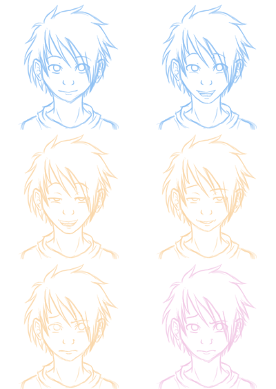
Monday, 12 November 2012

Pick and mix 2

Done a few concept things for the pick and mix.
The first one is an idea for the Angels/law firm office he works at. Was thinking of picking lighter colors from pictures to make them be the good guys at the same time as Georges Barbier seem to use a lot of pastels and blues in some pictures. There is a phoenix at his desk since I thought of picking that as their logo thing, also my artist seem to like to draw birds, especially phoenixes. I simply decided to name them Phoenix legal company for now.
I know he really loves his bright red, but I thought I'd save that and the heavy black/gold for the demons office/law firm and also use a dragon for their logo/mascot as he have drawn a couple of those, it will also symbolise more of a threat since dragons are big and scary. Not sure what to call them though....


Did a few concept drawings which I colored.
One for the city the law office is in (featuring the mentor and the angel), the train they have to take to get to the allotment area and a little part of an allotment. I left the sky white in the last one because my artist sometimes does that, but I will probably draw a new one with blue sky.


These pictures are mainly testing to see how things might work, so none of them are final, especially not the allotment one. I find it really hard to keep the style of my artist while trying to draw normal looking things, mainly because he only ever do single illustrations which means he get to play with just how much detail he want to, or lack thereof. I feel like I can't really do that when I need it to be a specific place, like the city. I can't just have a big open space with one building on it. So I'm trying my best to at least keep the shapes and the typical types of buildings that he does.

With the allotment I feel like I'm trying to draw an organized version of Alice in Wonderland. He's got lots of pieces of plants and nature in his work, the only thing is that he loves to make that the most detailed thing in the entire image, so it does take up a lot of the attention. I won't have much of a problem with my Phoenix lawyers as they are quite simple, but my demon might prove a problem as she is based on his more pattern crazy clothing he's done.

Tuesday, 23 October 2012

Pick and Mix

For our pre production class we have to make a short cartoon based on cards that we picked. I ended up with the following cards:

Artist - Georges Barbier
Theme/Show  -  Legal thriller
Character - Angel
Location/setting - Allotments

I find it funny how it all worked out with the combination, it's really easy to come up with things at the same time as it's rather hard. Trying not to fall into the trap of basing it a lot of other shows at the same time as the simplest explanation of how it will work out up to now have been me throwing out "Law and order meets supernatural in a garden patch and they have legal battles like in Phoenix Wright."

I've been toying a bit around with Barbier's style, I did find the eyes in his drawings to be kind of small, so that is a thing I have changed a little, but I tried to keep as much as possible from his original style in my sketch work.


Been thinking of putting the entire story to a 20's England, toyed with the thought of Denmark for a little while since they have had allotments from an early age there as well, but didn't seem to find too much information on the 20's from there.
Or maybe I should just make up my own world entirely...
Either way it's 20's style all the way.

Sunday, 14 October 2012

TYSON

We have been put in groups for a project where we have to do a title sequence.
The guys in my group decided they would go with the one where we pick a person to introduce, and we ended up with Mike Tyson.

I did a quick idea to do the beginning of the title sequence.
Since Mike Tyson comes from Brooklyn, New York it starts with the torch of the statue of liberty, and zooms out to reveal Brooklyn in the background. A bunch of pigeons come flying across the screen, one of them covers up the entire screen, then the name Tyson is revealed, having little feathers float down on the side.

Tyson likes pigeons, and I find that to be quite a contrast to someone who is known for knocking people down, so I thought the transaction from a seemingly peaceful New York with pigeons into the bold red background Alex came up with would work rather well as an example of this conflicting image I get.

Monday, 28 May 2012

Lanto and Ciara


He's supposed to say "Mmmhh, It would be nice to come over...".

A little something I did based on a picture I made for Kerri a long time ago. Figured it would be simple enough to try out while figuring out how to work the photoshop animation feature. I must say, I like it most of the time.
I can draw with my beloved opacity and now that I figured the frames are exactly the same as the layers it's really easy to do it. The only thing I miss is a proper timeline for the times I want something longer or shorter than the set times you can pick from - but I don't see why I can't learn how to work my way around them.

I actually find it more fun and interesting to animate like this. I can draw on the computer, but it's still pretty close to a traditional way of doing things with the whole "must learn timing properly on your own". I now think I appreciate dope sheets a bit more. They didn't make any sense when all I had to do was to copy-paste and tweak here and there - everything worked itself out smoothly, I didn't really need it. Now I appreciate having a paper telling me what comes when. I will probably have some more fun with this and see exactly what I can get done with it.

Wednesday, 9 May 2012

Backgrounds

Been doodling a few backgrounds of late, though I kind of think mine looks more like color test layouts or something rather than backgrounds.

 The two top ones are color tests for something I'm doing based on the Ranger Rick storyboards I had to do for storyboard class. I did the blue doodle first to get some idea where the characters would be so that I didn't do it too badly wrong with the placement.

 A picture I have tried to draw before, but never got quite happy with what I did the background in the previous version. I couldn't find the original picture to dig up, so I used the previous drawing as reference. Next time I'll be using the picture, because I do suspect I got a lot of things wrong, but still it was fun.

This last one is a background I have in mind for something I might use later, so it's more of a layout than anything else, testing the colors. I did the first digital one, but then I tried the same thing with watercolors in class, and I kind of liked that a lot better. I find the digital one to be kind of flat, and although the colors are correct to the environment it just doesn't really convey the feeling I want for it.


I liked the purple from the watercolor much better, though on the first one I went ahead and ruined it by adding yellow (at least I don't really like that part), though the water on the ground ended up just the way I wanted it.  So I did a second attempt, but did a more drippy water thingy on the wall, I do like that a lot. Will probably keep that look for it. It's more interesting to look at, and was actually a lot more fun to do than the digital one  :3

Monday, 30 April 2012

Storyboards and sketching


Two storyboards from a project I'm working on with a group of others. It's about a fisherman lost in the fog.


And some sketches of my friends bunny Angel for school sketchbook stuff.

Friday, 20 April 2012

Animation tests; Photoshop

Have been doing some small scribbles in Photoshop just for fun. I like animating in Photoshop of some reason, probably because it let's me have opacity (whoever makes flash - would you please include that in the brush options so I can see what I'm drawing? D= ). I like doodling sketchy stuff and the opacity lets me do just that. <3

Top one had a nice windy day blowing the hair...until I changed my mind.
(was gonna do Hare Hare Yukai, but I just didn't feel like it after the first 3 frames.)
Bottom one looks kinda like I coughed up a rainbow, but that's because the keyframes were done in different colors and I followed up by doing the frames in between in the same colors...and never bothered to change it.